
Rebrand the Police
Much of the recent furor to defund the police has come because police departments, in many places, are seen as needlessly militaristic at a time when the society’s problems aren’t going to be solved by military means. Do we, as a society, want a military force in our communities every day? Should police departments look and act like military forces? Is there a way design can help change our perception?
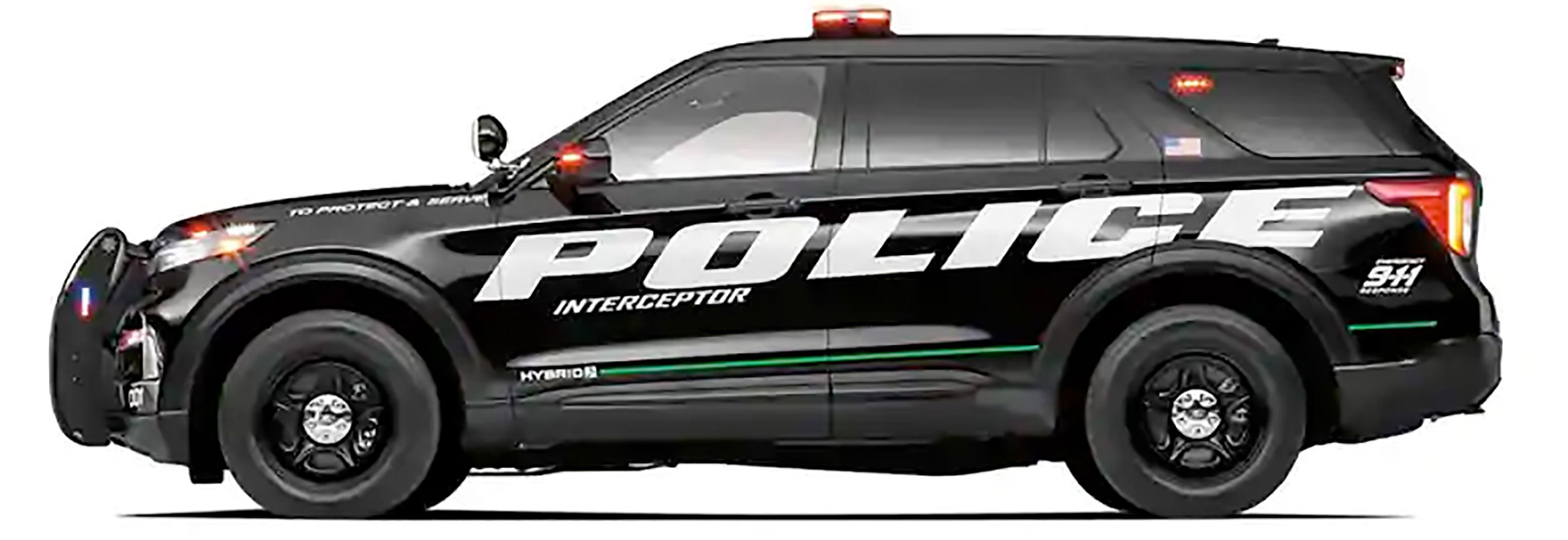
Let’s consider “Police” as a brand, perfectly summed up with the aggressive graphics on this sample vehicle. The car is black—sinister and dark—the graphics convey a perpetual state of motion. The super-italic bold extended font feels authoritative and powerful—perfect for flying down highways catching bad guys. No doubt this is how a police force would want to be perceived—to be feared (but by everyone?). But is this who we want our police departments to be?
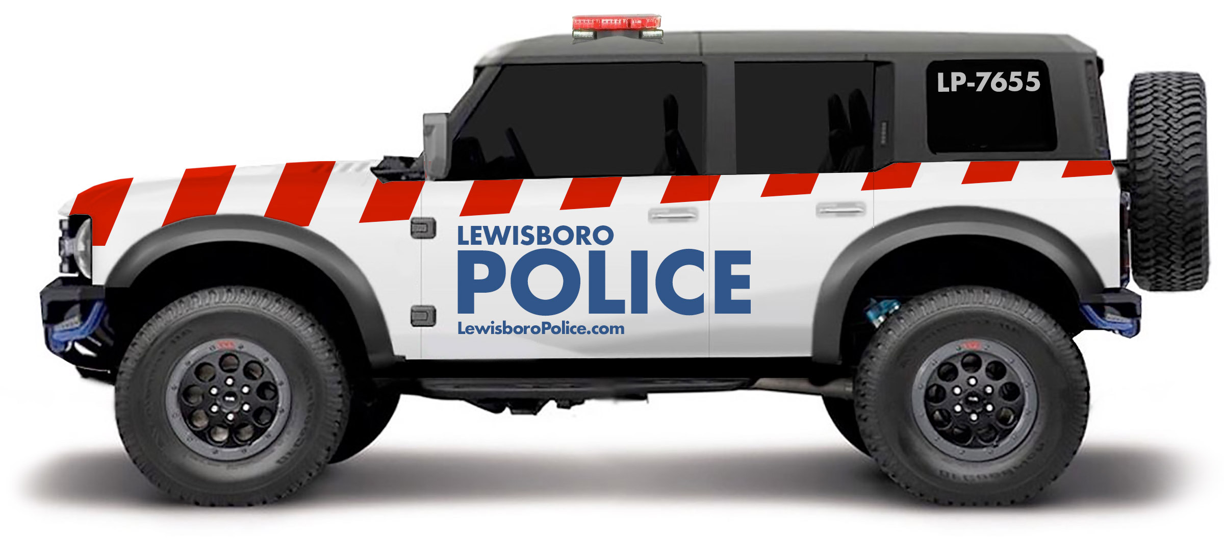
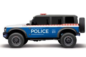
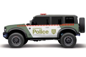
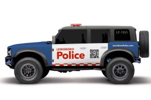
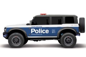
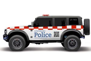
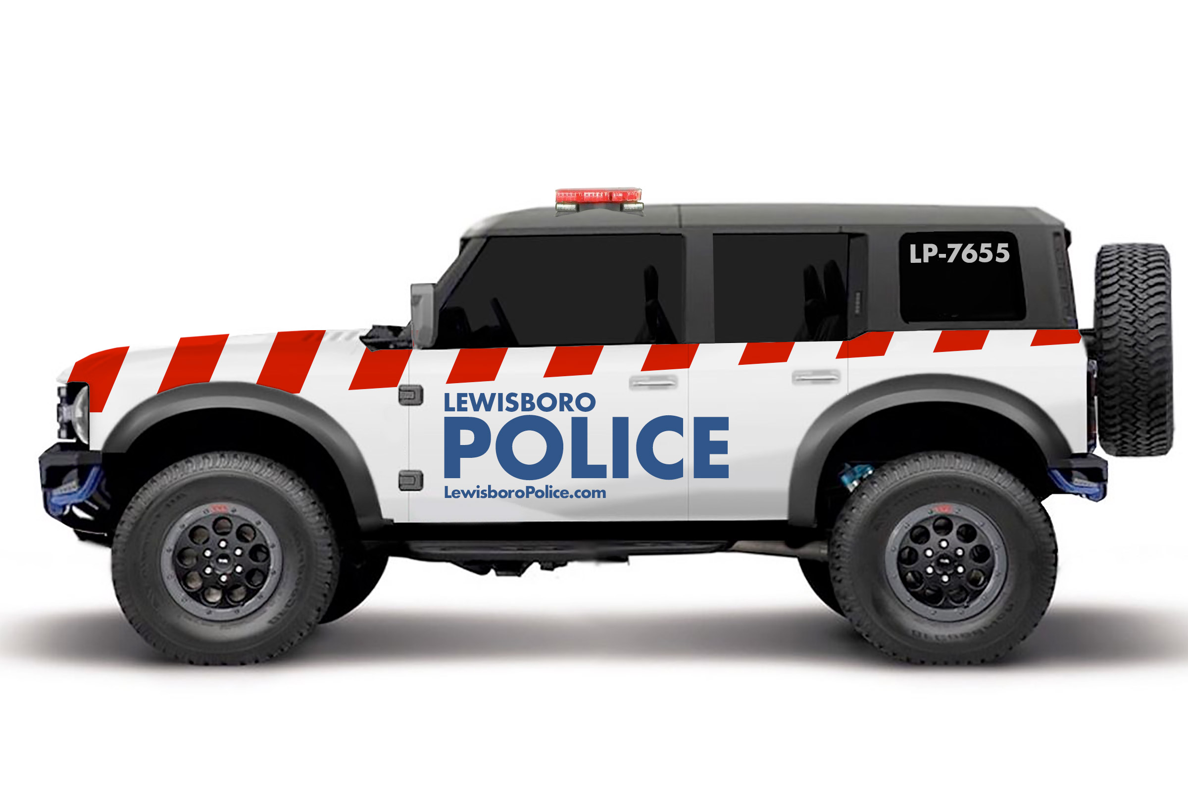
Instead, what if we decided that our police departments were organizations to give aid? How would our brand look to achieve that? This reimagined vehicle is white and appears less threatening. The graphics are bold but friendly. The red stripes convey a sense of action and serve to increase the vehicle’s visibility. A URL for the police department is prominently displayed so that if someone in the community needs to contact them, follow up on a report, or lodge a complaint, they have a location to do so. The perception is no longer one to be feared.
While this is nothing more than a concept to show how changing a brand can change perceptions, real reform is achieved through the actions of the personnel involved.


