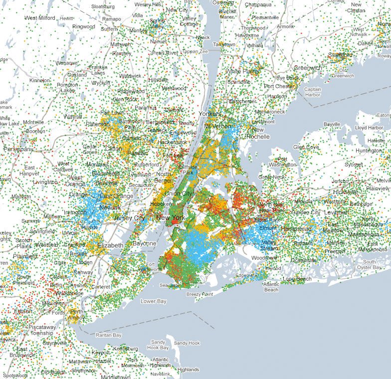
Interactive Census Map
Everyone knows that the census takes in an extraordinary amount of information about the U.S. population but, once collected, how do you display it usefully? The New York Times created a series of interactive maps showing ethnic breakdowns, density, education, income, and various breakdowns within those categories. The information can be viewed on a census tract basis which allows for very detailed analysis or can be viewed zoomed out to see regional overviews. The amount of information shown is impressive as is the clarity of the data. Visit the New York Times site to see for yourself ››
Recommended Posts


